Windows Media Player
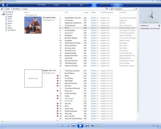
Windows Media Player (WMP) has once again seen an update, in fact this is the first time Microsoft has shown off version 11, albeit a very early version. As you can see in the screen shots, it has been simplified and given a nice clean look. Real-time search (ala iTunes) has been integrated and works well. A number of different ways to view and organize your media are included and have been jazzed up graphically, though it still makes for a poor juke box compared to Apple's champ.

Media Player has a few new tricks
I had some breaking issues with this iteration of Media Player, though. While videos seemed to play just fine, I still haven't gotten any music to play. It keeps telling me that it cannot play anything I've given it including mp3 files, wma files, protected wma files and a plain old music CD. I'd show you a screen shot of the error, but the print screen function has decided to quit for about the eighth time in the last three days. They still have a lot of work to do.
Windows Media Center
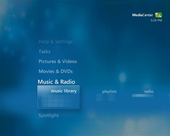
I kinda like the current generation of Windows Media Center. As far as the so-termed "10-foot interfaces go," it is the cleanest. It does what I need it to; all while my fat, lazy rear rests comfortably on the couch - true innovation. But of course they had to change it. If you found the old version a little too clean and easy to use, you should be happy. While the current build seems to add no new features, it certainly is a pain to use. As you can see below, even the main screen has an added level of complexity.

Windows Media Center
The Media Center interface now seems to take advantage of Aero. This means more animation, though I really don't think it adds anything to the overall package. While WMP has gotten classier it looks like Windows Media Center has gone the other way. Let's hope they see the wrongs of their ways before it starts shipping.