Aero & Glass
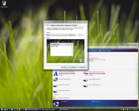
Aero is an acronym, according to the good folks at Wikipedia, for Authentic, Energetic, Reflective, and Open. I guess calling it Microsoft Quartz would be a bit too blatant. While it gives Windows a cleaner and more aesthetically pleasing interface, the new features are really eye candy. Aero does allow for a lot of graphics processor assisted eye candy including transparencies and animations, but this is hardly a new feature.

Aero + Glass, beautiful new Windows
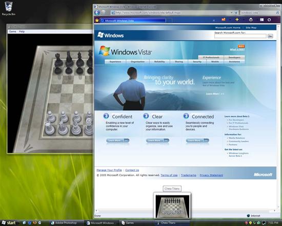
Glass is the new theme that takes advantage of the Windows Presentation Foundation system. Transparencies? Check. Cool out-of-focus background for use with transparencies? Check. Windows fly around, expand, contract and smoothly fade? Check. It seems like they let the PowerPoint transition guy take his hand at a user interface. At first it feels ok, a little eye candy never hurt anyone after all, but you'll tire of it soon enough. In the end animations, pretty or not, slick or not, take time and I'm not after a slower Windows experience. You can turn off all the fancy animations and effects of course. Here are the two major animations I've noticed so far. When you minimize a window it flys down to the task bar; when you click on a minimized app it expands/flys back out (very much like the default effect on OS X). Most windows boxes fade/expand in and fade/shrink out, this even works inside applications like Photoshop.
The taskbar hasn't seen too many changes for this build of Vista. It behaves like its trustworthy predecessors in Windows XP with a few cosmetic changes. As you can see in the pictures, it is now somewhat transparent, using the same out-of-focus trick as the windows do, and it is much blacker. It also will pop-up a preview of the application as you mouse over the bar. This only works for the programs that are somewhere on screen though, the folks in Redmond have taken the easy road at the moment and ignored minimized applications. Expect this to change.

Preview on mouse over, only works for apps that are not minimized
The start menu has been changed, though it still has a familiar feel. The major difference is that when you need to see applications that are not in your frequently used list they appear in place of said list instead of popping up a menu. In addition, folders open within the box rather than popping up their own menues. The downside to this is that far fewer items can be displayed compared to the menu behavior in Windows XP.