Search
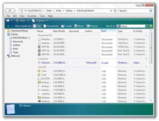
A new aspect of file system navigation in Vista is a combination of the Library and Search. The Library is essentially a catalog of all of your files, regardless of where they are located. The library can be browsed by a number of different criteria, including Date Modified, Keywords, Author, Kind, and Type. When you perform a search, it will generally be from either the current view or of some subset of the library:

Search
Search then groups the results by type. You can think of the library as a variety of virtual folders tied to searches for something like "*.*". If you then go to, say, Type and browse to Bitmap Image, you will be presented with a search analogous to "*.bmp". During my encounter with Search and Library, I found Search to be much more useful than Library. Library could certainly use some work both in terms of presentation and in terms of clarity (it really isn't immediately clear what it is).
Windows Media Player 11

Windows Media Player 11
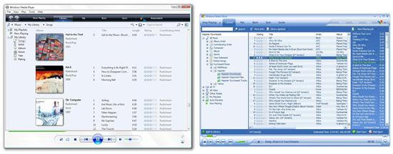
As you can see, the difference is quite striking. Windows Media Player 11 makes use of a new library view built around album art. This interface works well when you have full albums for any given artist; however, if you have only one song from many artists - which is often the case - it can end up being pretty inefficient. Luckily you can flip views with a touch of a button (similar to how you can change views in Windows Explorer).
Another major change is Vista-styled navigation at the bottom of the screen. Similar to Calendar and Windows Photo Gallery. A round button flanked by left and right navigation buttons forms the center of the control cluster at the bottom of WMP 11. This consistent look across some of Vista's built-in applications is interesting. Probably the most important built-in application is Internet Explorer, which currently lacks this configuration so there is probably a limit to how consistent the interface ends up being.
WMP 11 also sports a very responsive as-you-type search function, no doubt copied from iTunes, which didn't invent the feature either. WMP 11 also has a breadcrumb bar (e.g. Music > My Library > Songs) and back and forward buttons. Incidentally, this brings up an inconsistency. Everywhere in Vista, "My Music" has become "Music" but in WMP 11 "My Library" is still "My Library."
Overall WMP 11 is a little ugly - aesthetically - as it stands now in beta. You should expect Microsoft to clean up WMP 11 cosmetically. Early betas of WMP 10 were quite hideous due to their early state; WMP 10 ended up being a reasonably attractive looking application.
A major coming addition to WMP 11 that was just announced at CES is MTV's URGE. It will be the first subscription music service to be integrated directly into Windows Media Player. At the moment, such services as Napster and Yahoo Music Unlimited run as separate programs, which is something of a disadvantage given that they are prone to glitches and stability problems. A stable, Microsoft-certified music subscription service would be very nice.